
In the tumultuous world of luxury fashion, where brands rise and fall with the tides of trend and taste, few symbols have stood as steadfast and instantly recognizable as the Louis Vuitton logo. This emblem, composed of the intertwined letters "L" and "V," is not merely a hallmark of quality and craftsmanship; it is an enduring icon of style. Integral to the emblem's allure is the distinctive font that spells out "Louis Vuitton." Here, we delve into the history, design elements, and cultural impact of the Louis Vuitton logo font, unearthing the reasons behind its timeless appeal.
A Brief History
Louis Vuitton began in 1854 when its founder, Louis Vuitton, set up a shop in Paris to make trunks. The famous LV logo we all know today wasn't made until Louis's son Georges took over. He created the logo in 1896 to make the brand stand out and to stop people from making fake products. The choice of font used in the logo and for the brand's name was also made with care, so that it would show off the brand's fancy, stylish, and long history.
The Design Elements
The Louis Vuitton logo font is more than just a series of letters; it's a carefully constructed element of its brand identity. Although the exact specifications of the font are a closely guarded secret of the brand, typography experts speculate that it draws inspiration from classic serif fonts. The font highlights the brand's luxury provenance with its sharp serifs and refined weight, which allows it to stand boldly on any surface, from the delicate canvas of a handbag to the imposing façade of a flagship store.
When discussing design elements, it's important to note that Louis Vuitton uses two main fonts:
- Louis Vuitton logo font
- Louis Vuitton Monogram font

Let's discuss both design elements of the French brand.
Read More: Everything on Gucci Logo Font
Which Font Does Louis Vuitton Logo Use?
The Louis Vuitton logo, particularly known for its LV monogram and wordmarks, utilizes the font Futura Medium for its wordmark portion. Futura Medium is a geometric sans-serif typeface created by Paul Renner in 1928. This typeface is characterized by its clean, straightforward shapes.
The prominent characteristics of the font include the strong, vertical strokes and slightly condensed letterforms, which convey confidence and the sense of luxury. The "O" appears a perfect circle rather than oval, a subtle deviation from more traditional serifs and a nod to the originality at the heart of Louis Vuitton's ethos. Similarly, the "V" is particularly notable for its precise, pointed apex, signifying the pinnacle of high fashion.
When it comes to finding similar fonts in Microsoft products or on platforms like Canva, you can look for fonts that share the geometric, clean qualities of Futura Medium. Fonts such as Twentieth Century and Calibri can serve as alternatives with a somewhat similar vibe in Microsoft products. On Canva, options like Montserrat or Raleway can offer that modern, geometric appearance akin to what Futura Medium offers. These alternatives are chosen for their clean lines and geometric forms, making them suitable for a wide range of designs that seek to replicate a similar luxury and modern aesthetic.
Which Font Does Louis Vuitton Monogram Use?

The hand-drawn font that characterizes the iconic LV monogram, featuring an italic uppercase "L" overlapping with an uppercase "V," was first introduced in 1954. This unique lettering, intertwining the "L" and "V," has come to symbolize the luxurious brand while maintaining a significant trace of its historical roots. Both letters feature bold, elongated serifs with thick, distinct lines.
Cultural Impact and Recognition
The impact of the Louis Vuitton logo font on culture and fashion is immeasurable. It has transcended its role as a mere typeface to become a symbol of luxury, aspiration, and a testament to the legacy of its founder. The font, particularly when used in the LV monogram, is immediately recognizable around the globe, often representing more than just a brand name but a status symbol and an emblem of fashion itself.
Its influence extends beyond the realm of high fashion into popular culture, where it has been referenced in songs, films, and art, becoming synonymous with affluence and high status. Furthermore, the Louis Vuitton logo font has inspired numerous designers and brands, underscoring the brand's pioneer status in the fashion industry.
Challenges and Evolutions

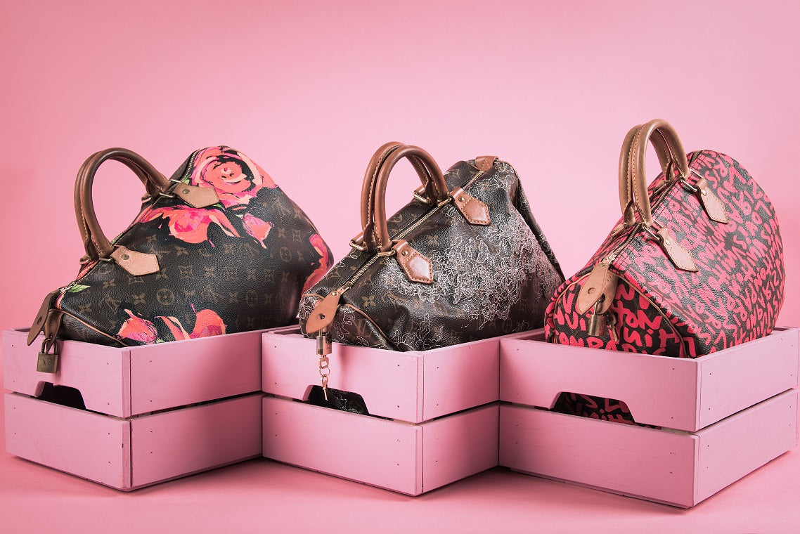
The digital age has presented new challenges for traditional luxury brands, including how their branding translates across various digital platforms. It's worth mentioning that Louis Vuitton has been using a lot of different fonts, both in their logos and their iconic monogram. For instance, in 1920s-30s Louis Vuitton was using the font that was very different from Futura Medium. Nowadays this font is not used for logos and can only be found on some limited edition bags inspired by the rich French brand's history.
What's So Unique About Louis Vuitton Logo?
The Louis Vuitton logo is renowned for its uniqueness and has several standout features:
-
Consistency in Design. Louis Vuitton has maintained the original essence of its logo since its inception, sticking with the iconic LV monogram and the floral pattern. Though minor modifications like font color adjustments have occurred, the core design remains unchanged on products.
-
Resilience Against Criticism. Despite occasional negative press suggesting that customers might be growing weary of the 'LV' monogram, the brand continues to thrive. Forbes reports that Louis Vuitton as the world's 9th most valuable brand, while Bernard Arnault, the company's owner, is the world's richest person.
-
Selective Trend Adoption. Louis Vuitton is cautious about following trends. Like Balenciaga’s use of the “B” logo on models' nails became popular, Louis Vuitton remains selective, focusing on trends that enhance rather than dilute their brand identity.
-
Strategic Collaborations. Louis Vuitton selects collaboration partners that align with its brand values, ensuring its unique identity shines through even in partnerships. This approach helps maintain a clear and powerful brand message.
-
Logo Optimized Web Presence. On its website, Louis Vuitton smartly balances its visual elements. The site features the LV monogram and the brand name separately to avoid visual overload. This strategy ensures the website remains user-friendly and effective across both desktop and mobile platforms.
In summary, the uniqueness of the Louis Vuitton logo lies in its historical consistency, careful partnering, resilience against negativity, judicious trend engagement, and optimized web presence, all of which jointly contribute to its distinct and luxurious brand image.
Conclusion
The Louis Vuitton logo font is a testament to the power of typography in crafting and conveying a brand's identity. Through its sophisticated design, historical roots, and cultural impact, it continues to captivate and allure consumers worldwide, cementing Louis Vuitton’s status as a beacon of luxury and elegance in the fashion world. As the brand evolves, the logo font stands as a constant, a symbol of timeless style and enduring appeal in an ever-changing industry.